Diablo 3 news » Engineering Diablo III's Damage Numbers
To work in software development, whether it’s for business, entertainment, or your favorite video game company, is to know that simple problems don’t always have simple solutions. Game development is, in a word, complicated. There are thousands of moving parts where the smallest iteration can cause weeks of reversions and backtracking. On the outside looking in, it’s tempting to ask, “Why not just fix it?” That’s a bit like asking a baker why they can’t just substitute sugar for sucralose. The answer is similar across the board; “It’s not that simple.”
Numbers – How Do They Work?
In Diablo III, there’s lots of information thrown at the player. Let’s talk numbers. You see them everywhere! They’re on your gear, they’re in your character profile, and they float around your nephalem’s head while you’re in combat. Behind each of those digits is a huge amount of tech that makes them behave the way that they do.
We heard a lot of player feedback that combat numbers were starting to be overwhelming or difficult to comprehend in moment-to-moment gameplay. In the past, large numbers were exciting to see because they stood out above the rest. How do you bring back that emotional appeal without making players feel like they have lost power?
Patch 2.4.0 introduced a couple of new features to address this. First, we’ve introduced a new in-game option to truncate numbers and display them using abbreviations. Second, we’ve added an entirely new feature that highlights some of your largest damage numbers in a new color. Each of these additions presented their own challenges when we went to implement them; some were design issues, others created localization concerns, and at the end of all these decisions, the result needed to look good.
Initially, we had the idea of highlighting the top 5% of numbers you’ve generated in the last few seconds. The first problem with this approach was that every build is different, especially when it comes to how each dishes out damage. Some pump out small bursts of floating numbers over time while others barrage your screen with a constant stream of information. In our first pass, another issue that arose was that the new system didn’t accommodate expected fluctuations in damage dealt. Take a Power Pylon, for example, where your damage is temporarily augmented. After the Pylon ends, you’ll still want to know when you’re dealing notable damage.
We developed our algorithm over time to account for these outliers, settling on the following rules for which numbers appear in orange:
- Damage numbers must be over 10,000 to be considered
- If the damage number to be displayed is larger than the last that was displayed in orange, then display this new number in orange
- Decay the value of the largest number by 3% every second
- This reduces the likelihood that you’ll go on too long without seeing any highlighted numbers
- Ignore the first 10 large numbers
- This allows for the system to calibrate itself
- If no damage has been dealt for 10 seconds, reset the system
Where Are My Billions? – Challenges in Localization
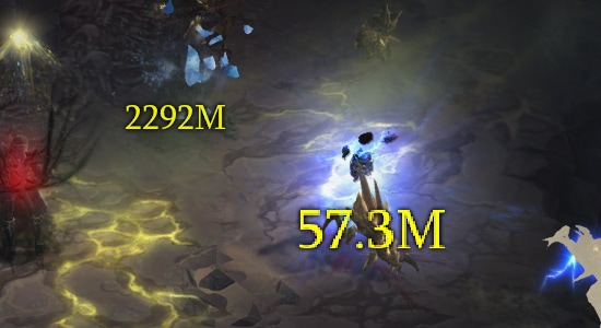
If you’ve played the latest patch, you may have already seen our new damage abbreviations. We’ve seen a lot of questions, primarily from our English-speaking audiences, about why we measure in millions, but skip counting in billions.
There are a few reasons, but one of the most important is localization. Diablo III is a global game, published in 13 different languages, so when we make a design decision that affects the written word (or, in this case, written number), we have to remain cognizant of what that change will mean in every iteration of the game. While you might think numbers would be the easiest thing to translate, that couldn’t be any less true.


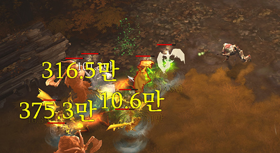
Left: English language numbers. Right: Korean language numbers.
Here’s an example where what might look like a simple translation can get complicated. Some languages do not commonly use a unique term for “billion.” They instead refer to that amount as what literally translates to “one thousand million” rather than having their own word. In terms of etymology, this is a result of both American and British English evolving the word “billion” to mean “one thousand million” rather than the “one million million” it originally represented.
It gets even more complex when looking at languages like Korean or Chinese, where large numbers are grouped on a different scale. For instance, in English, the nomenclature of a number changes with every third place, such as thousands, millions, billions and so forth. In Korean, the naming convention of a number instead changes every fourth place, using a method called myriad squared. This is because in Korean, numbers are grouped every ten-thousand fold instead of thousand fold.
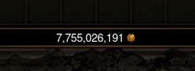
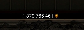
This issue is compounded by punctuation use. Not every language uses commas as breaks in numbers. Some use periods instead, which is very common in Europe, and others don’t use any punctuation at all.


Left: Korean gold count. Right: French gold count.
As numbers in Diablo III grew and we decided to add in numerical punctuation, we needed a way to elegantly “translate” where—and when—this punctuation would appear for each localization. Our code uses a library called ICU, or International Components for Unicode, which provides a great amount of support for localizing software. ICU can be used in a number of ways, but for this feature, we took advantage of its ability to take a number and a locale (such as United States English, French, or Korean) as input and give back a properly formatted number for that locale as output, complete with any periods or commas. Our Localization team also keeps a table that shows what numbers each region chooses to publish and the end result.
An example of one of our localization tables, designating which language truncates at what point.
Some localizations opted to abbreviate more or less, mostly out of cultural preferences. There’s a real psychology behind player satisfaction and the actual length of the numbers you’re seeing, and player preference varies on both personal and cultural levels. For example, in English, we opted not to abbreviate in the low millions because seeing “1,000,000” is much more satisfying than “1M.” Skipping the billions place also helped with this, as seeing “1,000M” tells a much more exciting story than “1B.” Of course, number size isn’t the only consideration; the visuals, colors, and movement all play a key role as well.
Making Numbers Pop – Refining Visuals
It’s important to make sure that when a player sees a number, they can quickly understand the implication behind it and what it means to them at that precise instant. In Patch 2.4.0, we aimed to provide even more in-combat information than ever before. This is where those Critical Hit highlight numbers come into play.
Look at that beautiful crit!
Simply changing the color was one of many ways we could have presented this information. We asked ourselves a lot of questions about how was best to communicate these big hits. Do we make these numbers bigger? Have them path differently? Make them flash? Do they hang on the screen longer? Or do we just give them a different color? How do you decide which of these options is the right one?
We gravitated towards color because we could present this new information to our players in a drastically different way that passed other user accessibility concerns. Orange numbers stand out; they’re not something you’ve seen before, so subconsciously you pay close attention to them.
Orange also passes the colorblindness-friendly test. When you’re looking at a color wheel, orange is in a different realm than the other colors we currently use for other information. This way players that are colorblind can tell something’s new, too!
When we look at changing colors in our interface, our artists take a look a three options for variation: Hue, Saturation, and Lightness. This is part of what’s called the HSL color space, a common digital standardization for the color wheel. Each aspect is key to adjusting a different emotion or evoking a new response from the player. Do we want to change the mood? Then we adjust hue. If we’re shifting an image from being juicy to more flat, then saturation becomes key. How about drawing attention or driving it away? Lightness becomes the go-to.
As an example, some of the most critical information in the game is how much healing you’re receiving. Healing is literally your life force, and we want it to be very visible. That’s why that information is some of the brightest in the game. We wanted critical hit information to be extremely visible as well, so we played a lot with its lightness levels to make sure you always know when your next big damage spike occurs.
Bring It All Together
When we talk about the Diablo III team, it’s easy to first think of our developers who tweak the way a class or an item functions, or put cool, new features in to explore. However, there’s so much more going on beyond what your hero is wearing or wielding, and our artists, engineers, localization experts, and so many more help us ensure everything comes together smoothly for all of our players around the world.
We hope you’ve enjoyed this in-depth peek behind the scenes of a small feature that, under the hood, is deceptively gargantuan! It’s a privilege to come in every day and work on this game, even when it’s on the little details. Thanks for reading!


 Update comments