Dota 2 news » Our force comes.
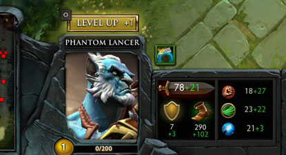
Don’t worry, your eyes are not playing tricks on you! That is indeed a brand new HUD you’re seeing. Today’s update includes the first of many upcoming revisions to our UI, starting with the in-game HUD.
When looking at feedback that we’ve gotten related to our interface, the first concerns we decided to address were:
- Inefficient use of space across all resolutions
- Having to jump through hoops to interact with the courier and glyph
- A lack of aesthetic coherency with the rest of the game visuals
To more efficiently use space in wider resolutions, we’ve made adjustments to the layout of the stats section. This also allowed us to include Move Speed as one of the stats readily available to players.

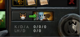
The Courier UI now exposes the state of the little guy, and allows item delivery with just a single click. Glyph state is also clearly exposed and easier to reach when you most need it.

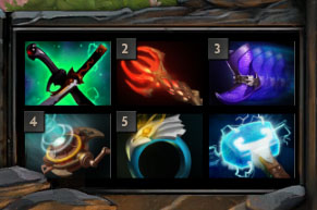
And finally we’ve also updated the look of our item icons.

As always, we would love to hear what you think of the changes, so feel free to leave feedback over in our UI forums.
Also released today is the Dota 2 replay parsing tool. This tool allows technically minded community members to extract data straight out of game replays. You can check out the technical documentation here. We can’t wait to see what kind of awesome data visualizations people come up with.
Meanwhile the community’s as busy as always, peep this:
- The Star Series is happening right now! Check out Purge’s stream for all the action, or if you’re just interested in seeing where he sleeps.
- And look at this thing!
Changelog? Yep, we got that changelog.


 Update comments