Starcraft 2 news » New User Interface Coming to StarCraft II
We’ve made major changes to the StarCraft II user interface as we prepare for Legacy of the Void and wanted to share what we've been working on and the reasoning behind the new design. The changes below will be released with Patch 3.0 and everyone will be receiving the update, whether you only own Wings of Liberty, Heart of the Swarm, or even just the Starter Edition.
A More Social Experience
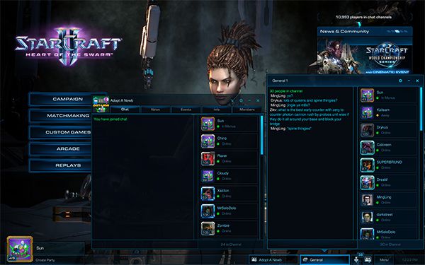
Our major goal with changing the user interface was for StarCraft II to be a more social experience. With this in mind, we examined the chat system and identified two major drawbacks with the multiple window chat system. The first issue was having to frequently minimize windows, which resulted in players being unable to quickly read and respond to chat. Secondly, we didn’t like how you had to leave an empty window open if you didn’t want to miss when someone joined an empty chat channel, potentially increasing the clutter on your screen.
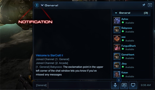
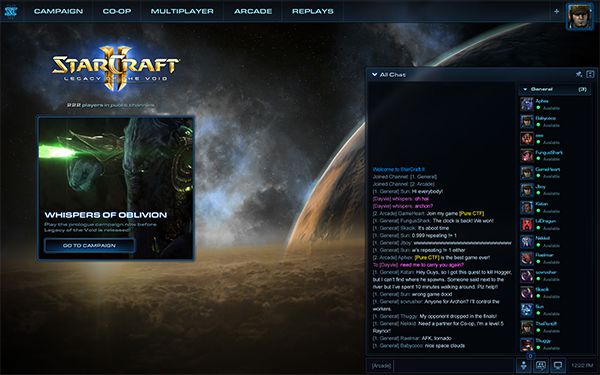
To tackle these issues, we made several changes. We consolidated all of chat into one prominently visible window. This persistent chat window ensures players always have the ability to engage with other players regardless of what they're doing in StarCraft II. We increased the maximum number of players who can be in a chat channel from 100 to 200 and added a function that will automatically remove inactive players from public chat channels. Lastly, every player that logs in will automatically be placed into a general chat, allowing them to instantly connect with the community.
Benefits of Multiple Windows
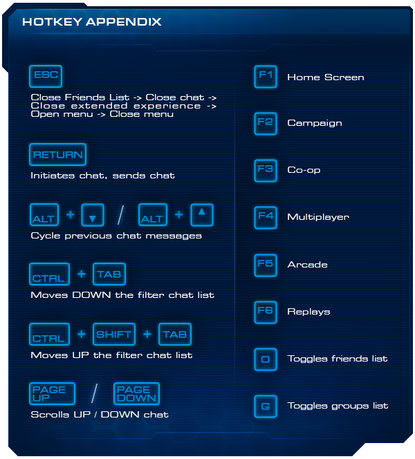
When making these changes to chat, we didn't want to lose the benefits of having multiple windows. Two benefits we identified were the ability to keep track of individual conversations and the fact that new messages were never missed. As a result, we added the ability to switch between conversations using the dropdown in the top-left corner of the chat dialogue, or by pressing CTRL + TAB or CTRL + SHIFT + TAB. If you receive a message from another conversation that you are not actively viewing, you'll receive a notification in the filter dropdown.
More Chat Improvements
In Heart of the Swarm, we introduced moderated chat channels through Groups and Clans, but joining those channels required many steps. In Legacy of the Void, we’ve made chat channels easier to join by added the ‘/join’ command. If you want someone to join your chat, all they have to do is type "/join <channel name>". If the channel name doesn't exist, they'll create and join a custom channel with that name instead.
For those who really want chat to be prominent, we added the ability to make the window taller and to pin it on the screen so it will remain open, even when you’re not typing in chat. We also improved chat performance, added an option to display a timestamp, modified text color so it's easier to distinguish between player names and actual chat, and added a number of hotkeys and slash commands - some of which are listed at the end of the blog.
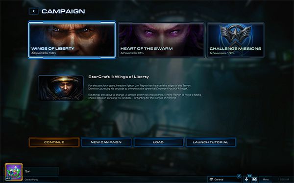
Heart of the Swarm Legacy of the Void
Overhauling the UI
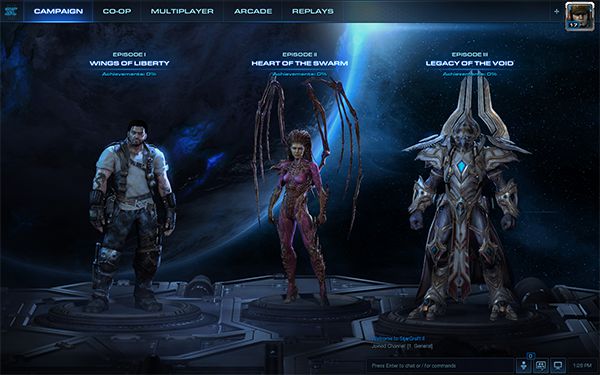
To ensure this new chat system would work well with the rest of the UI, it became clear we would have to redesign the rest of the game’s screens so we meticulously overhauled the spacing, format, and content of every section. In order to give our content more space, we moved the navigation, sub-navigation, and the party panel to the top of the screen. With this extra room, we saw an opportunity to inlay new 3D scenes into every screen to further bring the StarCraft universe to life in the UI.
Heart of the Swarm Legacy of the Void
For those who played the original StarCraft, the new campaign screen may look familiar.
Arcade Improvements
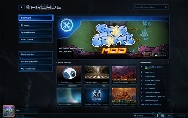
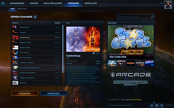
While revamping the UI, we also wanted to take the opportunity to make some improvements to the Arcade. In the new layout, we've moved ‘Open Games’ to be the starting experience for all players, and made the ‘Open Games’ list quicker and easier to browse. Instead of having to open and close the map info panel to learn about a game, the information now appears on the same screen and players can quickly browse one game after another to decide what to play. If the player tries to join a lobby that is full or if the game has already started, they are no longer put into an empty lobby. Top played games can still be found under the ‘Browse’ section, and we've modified the criteria for determining which games appear in the list so that more games have opportunities to reach the top.
Continuing with our desire to make StarCraft II a more social experience, we now automatically put players into a public Arcade chat channel as soon as they click on the Arcade button. Here, they’ll be able to chat with other Arcade players and use a brand new feature to help fill their lobbies. Players can now directly link into their Arcade lobbies by typing [Lobby] into the chat box. Any players who click on the link will instantly join that lobby. Now when you are looking for ‘pros only’ or need people to help test your latest creation, you’ll be able to advertise your needs in chat and provide a handy link for players to join.
Heart of the Swarm Legacy of the Void
We’re excited to bring you these changes and we'll continue listening to feedback from the community and make more improvements in the future.
To help you prepare for the new UI, we've also put together a list of hotkeys which you can reference for even simpler navigation across the interface.
We hope you enjoy the upcoming changes and we'll see you in General Chat!


 Update comments